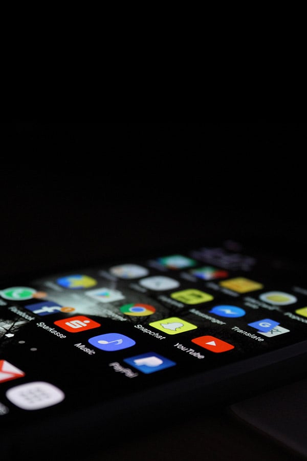
WhatsApp has announced a significant update to its mobile applications, featuring a refreshed and more streamlined interface. As part of this update, the company is unveiling a new “darker dark mode,” aimed at enhancing user experience, particularly in low-light conditions.
Historically, WhatsApp has concentrated on enhancing the app’s functionality. However, with the product’s continuous growth, there is a recognized need for design evolution. In conjunction with the new visual upgrades, the app introduces an updated color palette, curated after evaluating over 35 distinct colors. This refined palette emphasizes deeper hues designed to alleviate eye strain, thereby improving readability in dim environments. The dark mode, a favored choice among users, has been further darkened to facilitate easier message reading.

WhatsApp is enhancing its user experience on Android by introducing a native bottom navigation bar, designed to streamline access to key features. This navigation bar, already a staple on iOS, enables users to swiftly navigate through their chats, updates, communities, and calls.
For iOS users, WhatsApp is revamping the photo and video sharing process with a new attachment layout. This update replaces the full-screen menu with an expandable tray, offering a more intuitive way to select and send media, polls, documents, and other attachments.
In addition, WhatsApp is modernizing its visual design by adopting rounded, outlined icons, and updating the default chat background for a refreshed look.


